User experience (UX) is how people feel when interacting with a product or service.
A poor UX can drive users away, with 88% of consumers avoiding a site after a bad experience.
Great UX focuses on usability, accessibility, and making interactions seamless and enjoyable.
It’s the key to building products people love and keep coming back to.
In this blog, we are going to discuss various aspects of UX—its meaning, best practices, common mistakes, and how to fix those issues.
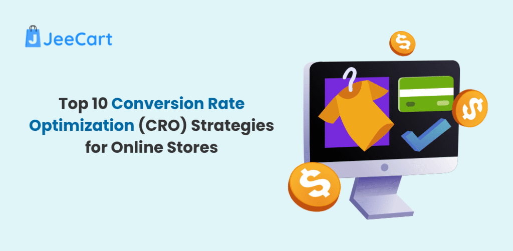
What is E-Commerce User Experience?
E-Commerce User Experience refers to the overall journey and satisfaction a customer has while interacting with an online store, encompassing everything from browsing products to completing a purchase.
A seamless e-commerce user interface plays a key role by ensuring intuitive navigation, fast-loading pages, and visually appealing designs that enhance the shopper’s experience and drive conversions.
7 E-Commerce UX Best Practices
If you’re all about making sales and creating an online shopping experience that feels effortless for your customers, you’re in the right place.
Let’s skip the fluff and dive into how to design online stores that turn visitors into loyal customers, starting with sales funnels, not just web pages.
Here’s the Secret Sauce to E-Commerce Success!
1. Prioritize Your End Goal
- Focus on the Goal: Your website isn’t a digital gallery, it’s your best salesperson. Every button, headline, and image should scream, “Let me help you buy this!”
- Minimize Distractions: Strip away anything that doesn’t move your customer closer to checkout. No flashy banners or endless pop-ups. Investing in professional website design services ensures every element is strategically crafted to guide visitors seamlessly toward making a purchase.
2. Build Sales Funnels, Not Just Web Pages
- Think Journey, Not Pages: Map out a step-by-step path for your customers. From the homepage to checkout, guide them with intention.
- Example Funnel:
- Ad Click: Grab their attention with a killer offer.
- Landing Page: Showcase the product and build trust with social proof.
- Checkout: Make it simple, secure, and lightning-fast.
3. Capture Attention and Intention
- Write Scroll-Stopping Headlines:
- “Get Your Dream Look in Just 3 Steps—Shop Now!”
- “Limited Time Only: 50% Off the Essentials You’ll Love!”
- Call-to-Action: Forget “Submit.” Use action-packed phrases like “Claim My Deal” or “Get Started Now.”
- Visual Pop: Use bold colors, high-quality images, and videos to pull focus.
4. Write User-Centered Copy That Clicks
- Speak Their Language: Your customers aren’t robots, so don’t write like one.
- Instead of: “Our products are high quality,”
- Say: “This hoodie feels like a hug you’ll never want to take off.”
- Solve Problems: Always answer, “What’s in it for me?”
5. Make Navigation as Intuitive as Breathing
- Clean Categories: Organize products in simple, logical sections. For example:
- Women’s Clothing > Dresses > Casual Dresses
- Search That Works: Add predictive search that suggests products as they type.
- Breadcrumbs Trail: Show users where they are and how to get back (e.g., Home > Skincare > Moisturizers).
6. Design with Mobile in Mind
- Speed Is King: Compress images and ensure your site loads in under 3 seconds.
- Thumb-Friendly Design: Buttons should be big enough to tap, even on the go.
- Vertical Layouts Rule: Think about how users scroll naturally on their phones.
Why User Experience is Important?
When you design with intention, you’re not just creating an online store—you’re crafting an experience that feels natural, exciting, and irresistible. Pro Tip: Test, tweak, and repeat. Use heatmaps and A/B testing to learn what works best for your audience.
Now, go out there and turn your
e-commerce site into a sales machine!
So, what are you holding out for? It’s time to implement these strategies and see your sales elevate!
Common e-commerce UX mistakes to avoid
In the fast-paced world of online shopping, user experience (UX) is the secret sauce that keeps customers engaged and coming back for more. However, even the best intentions can lead to frustrating errors that drive customers straight into the arms of your competition.
Let’s break down some of the most common e-commerce UX blunders and how to dodge them with a conversational twist:
- Cluttered Design
- Picture walking into a store where products are piled everywhere—overwhelming, right?
- A tidy design helps customers focus and find what they need.
Quick Fix: Use clean layouts, clear categories, and intuitive design elements to guide shoppers seamlessly.
- Confusing Menus
- Got amazing products but no way for customers to find them? Big problem!
- Keep navigation simple, clear, and accessible.
Quick Fix: Add logical categories, effective filters, and a smart search bar that feels like a personal shopping assistant.
- Too Many Steps
- Imagine filling out forms that feel more like tax prep than a shopping spree—no thanks.
- Complicated checkouts are one of the top reasons carts get abandoned.
Quick Fix: Offer guest checkout, minimize required fields, and make that “Buy Now” button impossible to miss.
- Shipping Costs
- Few things are as off-putting as surprise fees at the end of checkout.
- Hidden costs erode trust and make customers bail.
Quick Fix: Be upfront about shipping fees, highlight them on product or cart pages to build transparency.
- No Optimization
- Most people shop on their phones. If your site doesn’t work well on mobile, you’re waving goodbye to sales.
- Poor mobile UX sends the message: “We don’t value your time.”
Quick Fix: Invest in responsive design and test your site on various devices regularly.
- Unclear Product Details
- Customers don’t want to guess. Ambiguity = frustration = lost sales.
Quick Fix: Offer clear descriptions, accurate images, and all necessary details upfront.
- The Silent Shop: No Social Proof
- People trust people more than brands—it’s just how we’re wired.
- Reviews and testimonials build confidence.
Quick Fix: Feature reviews prominently, add ratings, and showcase user-generated content to give shoppers the social nudge they need.
- Pop-up Overload: Too Much, Too Soon
- Pop-ups can be highly effective, but if you overwhelm your customers, they’ll leave quicker than you can utter “discount.”
- Quick Solution: Utilize pop-ups infrequently, ensure they are pertinent, and make the “close” button clearly visible.
In a Nutshell…
- Achieving success in e-commerce isn’t complicated—it involves crafting a shopping experience that is easy, pleasant, and devoid of frustration.
- Not to Forget: Maintain cleanliness, clarity, and a customer-oriented approach, and your user experience will attract conversions.
- Now, proceed and impress your customers with an unforgettable experience (in the most positive way)!
How to Fix UX Issues on Your E-commerce Site
Let’s discuss enhancing the user experience (UX) on your online store. Whether users are leaving the homepage or discarding their carts, addressing UX problems can make a significant difference. Here’s how to make shopping on your website effortless!
Step 1: See Your Site Through Fresh Eyes
What to Do: Begin by viewing things from your customer’s perspective. Even better, request a friend, family member, or coworker who hasn’t visited your site to give it a try. Observe their shopping, what obstacles do they encounter? What bothers them?
AI Tools That Help:
- Hotjar or Crazy Egg: Heatmaps and session recordings show where users click, scroll, or just… leave.
- Surveys with Typeform or Google Forms: Ask your actual customers for feedback. A simple “What’s one thing we could improve?” can reveal a lot.
Step 2: Simplify Navigation
Imagine walking into a store where the aisles are mislabeled or shelves are in random order—chaos, right? That’s how confusing navigation feels to users.
Fix It:
- Streamline your menu. Use clear, simple labels (e.g., “Women’s Shoes” is better than “Step into Style”).
- Add a search bar. Make sure it’s prominent and works like a charm.
- Breadcrumbs: Show users where they are (e.g., Home > Electronics > Laptops).
AI Tools That Help:
- ChatGPT for Content Audit: Ask it to suggest concise, user-friendly menu labels.
- Klevu or Algolia: AI-driven search tools that help users find exactly what they need, fast.
Step 3: Make Mobile a Priority
Did you know over half of e-commerce traffic comes from mobile devices? If your site isn’t mobile-friendly, you’re leaving money on the table.
Fix It:
- Test your site on multiple devices (smartphones, tablets, etc.).
- Ensure buttons are big enough for thumbs and forms are easy to fill out.
- Use Google’s Mobile-Friendly Test tool to check for issues.
AI Tools That Help:
- BrowserStack: Simulate how your site looks on different devices.
- Adobe Sensei: Analyzes mobile design flaws and suggests improvements.
Step 4: Optimize Page Load Times
Fast websites = happy shoppers. Nobody wants to wait for a page to load—your competitors are just one click away.
Fix It:
- Compress images (use tools like TinyPNG).
- Minimize code bloat (CSS and JavaScript files, we’re looking at you).
- Enable caching and use a Content Delivery Network (CDN).
AI Tools That Help:
NitroPack or Cloudflare: AI-based tools to speed up load times without breaking your site.
Step 5: Improve Product Pages
Your product pages are the heart of your site. If they’re not informative, engaging, and easy to use, customers won’t click “Add to Cart.”
Fix It:
- Use high-quality images (360-degree views work wonders).
- Write clear, compelling descriptions that highlight benefits, not just features.
- Add social proof—reviews, ratings, and customer photos.
AI Tools That Help:
- Canva: Quickly create stunning visuals for product pages.
- ChatGPT or Jasper: Generate persuasive product descriptions in seconds.
Step 6: Smooth Out the Checkout Process
The cart abandonment rate for e-commerce sites averages around 70%. Let’s get that number down!
Fix It:
- Allow guest checkout. Not everyone wants to make an account.
- Simplify forms—ask for only what’s necessary.
- Offer multiple payment options (credit cards, PayPal, Apple Pay, etc.).
AI Tools That Help:
- Bolt or Fast: AI-powered checkout tools that reduce friction.
- Shopify’s AI insights: Analyze where customers drop off during checkout.
Step 7: Test, Iterate, and Repeat
UX isn’t a one-and-done deal. Keep testing and tweaking to stay ahead.
Fix It:
- A/B test changes using tools like Optimizely or Google Optimize.
- Monitor analytics. If bounce rates drop or conversion rates climb, you’re on the right track.
AI Tools That Help:
- AI Analytics Tools: Platforms like Amplitude or Mixpanel highlight patterns in user behavior so you can fix problems faster.
Final Thoughts
Making your E-commerce store look like a million bucks is all about blending a sleek design, top-notch user experience, and a dash of creativity. From the right visuals and layout to seamless navigation and optimized mobile experiences, these small details add up to create a shopping environment that feels professional and trustworthy.
Now, if you’re ready to level up your online store, why not give Jeecart a try? With its easy-to-use platform and customizable features, you’ll be on your way to creating a store that not only looks amazing but also drives sales. Start building your dream E-commerce site today and watch it grow!
FAQS
Why is UX important for E-commerce?
A positive UX boosts customer satisfaction, reduces cart abandonment, and increases sales. It helps create a seamless shopping experience.
How can I improve navigation on my site?
Use clear categories, search functionality, and intuitive menus. Ensure users can easily find what they are looking for.
What role does mobile responsiveness play?
Mobile responsiveness ensures your site works smoothly on all devices. It is crucial as many users shop via smartphones.
How do I reduce cart abandonment?
Simplify checkout, offer multiple payment methods, and provide clear shipping costs. Display trust signals like secure payment icons.
What are trust signals in E-commerce?
Trust signals include customer reviews, secure payment badges, and clear return policies. They build confidence in your brand.